 Hollister Logo PNG
Hollister Co. is a teen apparel brand and a division of Abercrombie & Fitch Co. Its identity draws on a Southern California surf and beach concept, with a flying bird above the HOLLISTER name. The company’s filings list the Seagull among its registered trademarks, and a 2026 company announcement describes the seagull motif as part of the brand’s identity.
The Hollister logo
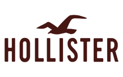
The logo artwork shown here combines a simplified bird in flight with a tall, uppercase HOLLISTER wordmark. The bird’s swept wings give the compact emblem a sense of movement, while the narrow letters make the name the dominant element. A separate version of the lockup includes CALIFORNIA beneath the name; the lettering remains plain and uppercase rather than decorative. The supplied typography specimen shows letterforms, but does not establish a typeface name.
???? – Today

This is the single documented logo stage in the archive: a flying bird paired with the HOLLISTER wordmark. A 2024 trademark opposition identifies multiple registered bird-design marks and gives first-use dates beginning in August 2003, with later dates for other marks. Those records document registered designs, not a confirmed sequence of visual redesigns. The mark remains part of Hollister’s identity: in June 2026, Abercrombie & Fitch described the seagull as a “signature” motif in its announcement of a Hollister home and dorm collection with Target.
Bird emblem and wordmark

The bird is the most distinctive part of the lockup. Abercrombie & Fitch Co. lists the Seagull as a registered trademark, and its trading subsidiary’s 2024 filing discusses ten registered bird-design marks used on clothing. The flying silhouette also fits the surf-and-beach positioning described in a 2006 trademark proceeding, which referred to a “youthful West Coast surfer’s lifestyle.”
Color and lettering
The logo is often shown in maroon, a dark brownish red, though versions also appear in black, white, grey, and pastel colors. The trademark filing describes the bird designs without a claim to a particular color. In the wordmark, the larger HOLLISTER line carries the name; in versions that include it, the smaller CALIFORNIA line sits below.

Why Hollister reduced prominent clothing logos
In 2014, Abercrombie & Fitch said it planned to reduce its North American logo business to “practically nothing” by spring 2015, while keeping logo products internationally. Reuters reported that the plan responded to weaker demand for logo-heavy clothing; it did not mean the seagull was removed from Hollister’s identity. In the second quarter of fiscal 2014, Hollister comparable sales fell 10 percent, while the company’s total comparable sales fell 7 percent, according to Forbes and Reuters’ coverage.
Hollister’s seagull therefore has two related roles: it is a registered bird design and a recognizable element of the brand’s surf-inspired visual identity. The 2014 change concerned how prominently logos appeared on clothing in North America, not the end of the emblem.
View the Hollister logo archive entry.
Disclaimer
This article is part of the educational resources provided by Logo Index, an independent archive covering logos, visual identities and graphic design history. Hollister and associated trademarks and brand assets remain the property of their respective rights holders where applicable.