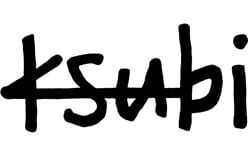
 Ksubi Logo PNG
Ksubi’s identity combines a lowercase, hand-drawn-looking wordmark with a cross enclosed in a box. The wordmark gives the name an informal, uneven character; the emblem supplies a compact graphic mark. The brand calls the emblem its “ksignature t-box” and also identifies the pocket flag and rat’s tail as signature details on its history page.
Meaning and history
Ksubi began as Tsubi in 1999, when a group of friends made screen-printed T-shirts and denim in a North Sydney garage, according to the brand’s account. The name changed after a 2006 settlement in a trademark dispute with footwear company Tsubo. The Sydney Morning Herald reported that Tsubi could continue using its name in Australia while trading as Ksubi elsewhere; later coverage describes the brand under the Ksubi name.
1999 – Today
This heading spans the brand’s history, but the Ksubi spelling belongs to the 2006 renaming, not the 1999 beginning. The wordmark shown here uses four lowercase letters in loose, irregular strokes. Its changing line weight and relaxed alignment make it look hand-drawn rather than mechanically uniform. The brand continues to use the lowercase name alongside its t-box emblem, as shown in its current brand materials.

The wordmark’s distinctive feature is its informal lettering: the letters are large and closely set, with a pronounced crossbar through the first letter. The move from Tsubi to Ksubi changed the initial letter of the name; it did not establish a documented alternate reading or symbolism for the mark.
The box-cross emblem and garment details
Ksubi’s “ksignature t-box” is also described in trade coverage as the box-cross logo. WWD has characterized the box cross as enduring brand DNA, while the brand lists it alongside the pocket flag and rat’s tail as recurring signature details (WWD; Ksubi). On clothing, the pocket flag carries the identity onto a back pocket, and the rat’s tail adds another recognizable garment detail.
A four-cross version has also appeared in the brand’s recent identity work. Hypebeast reported that Ksubi’s 2026 4X4 Luxe capsule refreshed the four-cross insignia; that use extends the emblem rather than replacing the lowercase wordmark (Hypebeast).
Disclaimer
This article is part of the educational resources provided by Logo Index, an independent archive covering logos, visual identities and graphic design history. Ksubi and associated trademarks and brand assets remain the property of their respective rights holders where applicable.