 Omsa Logo PNG
Meaning and history
Omsa is a hosiery brand in the Golden Lady Company portfolio. The group records Omsa’s acquisition in 1992, and its brand page describes Omsa as a historic brand dating from the 1950s (Golden Lady Company history; Omsa brand page).
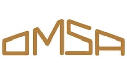
The logo shown here spells OMSA in capitals. Its letters have an angular, outlined appearance, with a warm gold-brown color against contrasting backgrounds. The wordmark is the identity’s central element; the supplied mark does not include a separate pictorial symbol. No designer or typeface credit is established in the cited history.
An early documented appearance comes from a “Concorso Omsa” advertising poster dated circa 1955–1960. The Italian Ministry of Culture’s record describes the artwork as a “Marchio OMSA sagomato,” or shaped OMSA mark (Italian Ministry of Culture catalogue). This establishes the mark’s presence in period advertising, but does not establish that the logo began in 1952.
Later advertising provides context for the brand’s identity without documenting a wordmark redesign. Omsa’s brand history recounts 1960s Carosello commercials featuring the Kessler twins and the “Quante donne sei?” campaign of 2002–2004 (Omsa brand history). These are campaign milestones, not evidence of a changed logo.
A packaging update announced for the Russian market in spring 2022 changed the typeface used on pack and introduced a more saturated metallic background, while retaining other signature design elements (Omsa Russia packaging announcement). The report concerns Russian-market packaging; it does not establish a global wordmark replacement.
1952 – Today

This stage image shows the OMSA lettering in gold-brown on a light background. Its angular outlined letters match the wordmark in the lead image, while the background treatment differs. The heading is retained as supplied, but the Ministry of Culture’s circa 1955–1960 poster record is the independently documented early appearance; it does not verify 1952 as the logo’s starting date. The Russian packaging update describes changes to the presentation around the mark, not a documented redesign of the wordmark.
Disclaimer
This article is part of the educational resources provided by Logo Index, an independent archive covering logos, visual identities and graphic design history. Omsa and associated trademarks and brand assets remain the property of their respective rights holders where applicable.