BAC is the short form of Briggs Automotive Company, the British specialist behind the Mono, a road-legal single-seater supercar built in Speke, Liverpool. The business is closely tied to two brothers: Ian Briggs, its design director, and Neill Briggs, who heads product development. Concept work on what became the Mono began in 2007, while the brothers were running a design and engineering consultancy, and the car itself was unveiled at the Retro Classics show in Stuttgart in 2011 [1].
For a manufacturer of this size, a logo carries unusual weight. BAC does not sell in volume, so its badge functions less as a mass-market signature than as a marker for a small, technically minded operation: a compact abstract mark, usually reproduced in black on white, paired with a plain uppercase wordmark.
 BAC Logo PNG
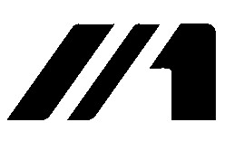
The BAC emblem
The mark is abstract rather than pictorial. Two diagonal strokes dominate it, with the left stroke noticeably heavier than the right, and a separate vertical element that reads like a numeral 1, finished with one rounded corner and one straight cut. Set together, the three forms occupy a roughly square field, and the composition visually echoes the initials of the company name without spelling out any letters literally. Nothing in the badge depends on fine detail, which is why it holds up at the scale of a nose cone or a key fob.
The angled forms also appear integrated into the Mono nameplate, where the symbol takes the place of the first letter and reads as an M in context. Readings that assign speed, motion or a podium message to the strokes are interpretation rather than documented brand messaging. BAC’s own published design commentary deals with the car rather than the badge: the company describes the Mono’s primary aesthetic as inspired by the robot in Björk’s 1999 video for “All Is Full of Love,” and summarises its approach as form enhancing function [2]. The same restrained logic runs through the identity.
Small British performance marques tend to end up with highly graphic badges for the same reason, since there is no heritage crest to lean on. Brabham Automotive is a comparable recent example.
Identity design and the 2011 launch
The clearest documented point in the history of BAC’s visual identity is the 2011 launch period. The Berlin studio Projekttriangle was credited with developing the company’s corporate identity, including the signet, its applications, imagery and a complete style guide [6]. That programme is the identity work with a real date attached to it.
Claims that the badge was introduced in 2009 and left untouched ever since are hard to support. BAC was incorporated as a separate company in 2009 [5], but no corporate identity work from that year has been traced, and no dated corporate redesign of the mark is documented either. The practical reading is simpler: the badge shown here is the current one, and its exact first appearance is not well documented.
Wordmark and typography
The wordmark is set in capitals, with softened corners and a fairly even stroke weight, and it is spaced generously enough to sit comfortably under or beside the badge. The typeface itself is not documented by BAC or by its identity designer, so attributions to named commercial fonts circulating online should be treated as unverified. What can be said with confidence is that the lettering is a clean geometric sans in the same stripped-back register as the symbol, and that the two elements are designed to be used either separately or together.
Colour
Most published BAC material shows the badge in black on a white ground, and that is how the mark is most often reproduced. The wider brand palette is not strictly monochrome, though. BAC names white, black and red as its corporate colours in its announcement of the Mono One final edition [3]. Red sits within the identity system and the cars rather than inside the badge itself, which keeps the logo graphic and monochrome while allowing the surrounding material to carry colour.
Mono One and special-edition logos
In 2020 BAC closed out the first generation of the Mono with the Mono One, a final-edition run. Those cars carried new and unique logos, including a design applied to the rear wing and headrests that drew on the robot from Björk’s “All Is Full of Love” video, the same reference BAC cites for the car’s primary aesthetic [3]. It is a commemorative application created for one model rather than a change to the corporate identity, and the standard BAC mark continued in use alongside it.
Names, word marks and the current car
A Taiwan trademark record lists BAC MONO as a word mark, filed on 1 December 2015 and registered on 16 August 2016 by Briggs Automotive Company (BAC) Limited, covering vehicles including cars and racing cars [8]. The record protects the name rather than a figurative version of the badge.
The Mono was renewed for a new generation in 2023, with BAC describing an evolved design language for the car while continuing production at its Liverpool base [4]. Hagerty’s profile of the marque puts the company at roughly 50 staff [5], which places it among the smaller operators in the British performance car sector, a group that also includes low-volume specialists such as Brooke Cars.
FAQ
What does BAC stand for?
BAC is short for Briggs Automotive Company, the British manufacturer based in Speke, Liverpool. It is named after the brothers who founded it, Ian Briggs and Neill Briggs, who lead design and product development respectively.
Who designed the BAC logo?
The Berlin studio Projekttriangle is credited with developing BAC’s corporate identity, including the signet, its applications and a style guide, in the run-up to the Mono’s 2011 launch. That is the only identity project with a documented credit and date.
Does the BAC logo contain a number one?
The badge includes a vertical form that reads like a numeral 1, set beside two diagonal strokes. BAC has not published a stated meaning for that shape, so describing it as a deliberate symbol of winning or first place goes beyond what the brand has said.
What are BAC’s brand colours?
BAC names white, black and red as its corporate colours. The badge itself is normally reproduced in black on white, while red appears in the wider identity and on the cars.
Why did the Mono One have different logos?
The 2020 Mono One was a final-edition version of the first-generation Mono, and those cars carried bespoke logos, including a design on the rear wing and headrests inspired by the robot in Björk’s “All Is Full of Love” video. It was a special-edition treatment rather than a corporate rebrand.
Disclaimer
This article is part of the educational resources provided by Logo Index, an independent archive covering logos, visual identities and graphic design history. BAC and associated trademarks and brand assets remain the property of their respective rights holders where applicable.